Since the last update, I've been working on a problem that becomes more obvious the longer I play: having plenty of choices is only useful if I can understand them in the middle of a campaign. That has meant bringing officer information together, making the menus feel like part of the same game, and going back over sieges from both sides of the wall.
This post covers the development work after Making the next order clear, through gameplay commit 2f9eb05. These are development-build changes, not an announcement that a new update is live on Steam. The screenshots come from in-game review scenarios across this work; they are not one continuous playthrough.
An officer I can actually find and command
I wanted to stop opening several different screens to answer simple questions about one person. Where is Xiahou Dun? What is he doing? What order did I give him? Can I speak to him here?
Officer cards and names now lead into the same screen, with Orders, Profile and History alongside one another. The officer's identity, location and activity stay in view while I move between them. “Profile” and “History” also say more plainly what I will find than the old dossier terminology.
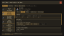
The profile keeps Xiahou Dun's current activity and location above his abilities and relationships. This is a staged officer review scenario.
Orders include their restrictions and costs where I make the decision. Contact options distinguish speaking in person from sending a message, and an unavailable action explains why. Locating an officer helps me find them; it does not quietly tell an army to move.

The same officer context stays visible when choosing a standing order.
Keeping the pixel game in the menus
I liked the clearer battle layout, but a few redesigned screens were beginning to feel detached from the little soldiers and towns around them. I've brought the remaining menus into the same pixel command treatment, including creation, council screens, settings and battle results.
The campaign shortcut rail pairs icons with names and keyboard shortcuts. The compact battle controls leave more of the field visible. I want the interface to help me read a busy game without losing its character.
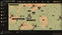
A native capture from the campaign UI pass. The left rail puts frequently used screens beside their shortcuts.
Creating a custom ruler has had a similar cleanup. Character, Abilities, Past, Faction and Review divide the decisions into recognizable steps, with portraits visible together and saved profiles available to return to. The creator uses the game's shared menu style and actual faction colors.
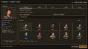
The Character step in the revised creator, captured during the menu integration pass.
A siege should keep changing as I fight it
Sieges needed the most work. Getting soldiers to a wall was not enough: a crowded landing, an unclear route down the stairs, or troops chasing past the place they were meant to defend could make the whole battle feel frustrating.
The rebuilt siege gives troops connected jobs. A ram order brings a crew, a screen and supporting bows into the assault. A climb needs room at the ladder and a foothold above it. Soldiers who get onto the wall use the stairs into the ward, then fight toward the gate controls and courtyard. Opening the gate creates a route for the rest of the force.
I found that too many bodies could be admitted to a ladder at once. Admission is now physically limited to four, with waiting positions and traffic rules. A command should not depend on soldiers piling through one another to work.
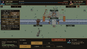
The attacker test late in a scripted production-host run. Both sides are still contesting the courtyard; this is actual battle rendering, not a concept image.
Defense has more to it as well. A defense-in-depth order keeps a gate guard and a courtyard reserve. Falling back can leave a short rearguard. Wounded guards can exchange places with healthier reserves when there is a clear route, and a sally opens the real gate for the selected force. Closing it has to wait until the doorway is clear.
I've also kept the slate walls and warm timber distinct from the field, and given the ward clearer paving and gathering space. Soldiers behind a friendly front rank no longer show attack effects cutting through it. Officers should still have dramatic presence, but the surrounding fight needs to make physical sense.
An army can still break before the courtyard is captured. I don't want to prolong an already-decided battle just to force the same ending every time.
Mandarin counterparts for the voiced lines
The Simplified Chinese version now has Mandarin recordings for all 104 active English ruler and rivalry lines, across seven speakers. These use ElevenLabs synthetic voices, retaining the existing casting where available. The English recordings remain available.
That is parity for the voiced scenes, not a claim that every conversation is spoken. Ordinary officer and campaign dialogue remains text-first.
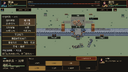
The final large-text Chinese siege UI check. This image shows the interface; the spoken-line coverage is tracked separately in the voice catalog.
What I am still watching
The scripted attacker and defender runs both reach an ending, and the opening scenarios have been useful for finding traffic and command problems. They do not settle siege balance. I still want to watch dense fights, stronger garrisons and whether the next useful command is obvious without knowing how the systems work underneath.
When you look at the siege, can you tell where you would commit the next group? And does the officer screen give you enough context to trust the order you are about to give?
Thanks for following along.
— Jeremy