Hey everyone!
As many of you have probably noticed, we've decided to move the release date of the free Car Rental Simulator Prologue. While this wasn't an easy decision, the extra time allows us to focus on what matters most - polishing the game and raising its overall quality to the level we want to deliver.
Over the past few weeks, we've taken a closer look at one of the most crucial elements of the game - the user interface (UI). Dry tables, flat menus, and intrusive pop-ups are definitely not the direction we want to take with Car Rental Simulator. We want to build a solid atmosphere and immersion, which is why our interface needs to feel natural, "juicy," and grounded in the game world.
We have a few fresh GIFs to show you how this looks in practice:
A Physical Sign

Opening and closing your business shouldn't just be a soulless click in an options menu. Turning on the OPEN neon and flipping the classic sign provides simple, yet satisfying feedback. It's a small detail, but this is exactly how we build the authenticity of your office space.
Tasks on a Clipboard
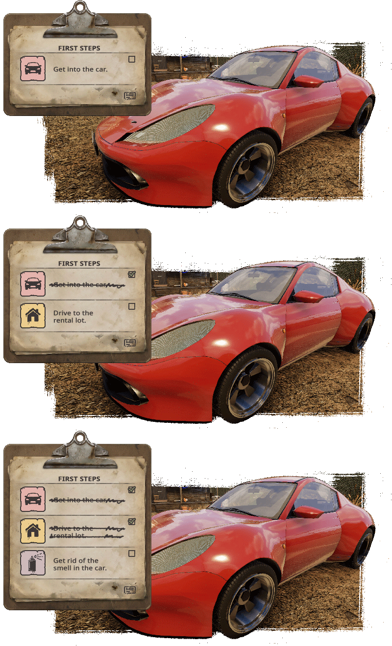
A rental owner has a lot on their mind, so we needed a clear system for tracking tasks. Instead of throwing more semi-transparent pop-ups on the screen, we moved the objectives list to an aesthetic clipboard. It's readable and doesn't artificially attack the player with UI elements - exactly how it would look if you physically picked up a pad with your to-do list.
Watch-Styled Minimap
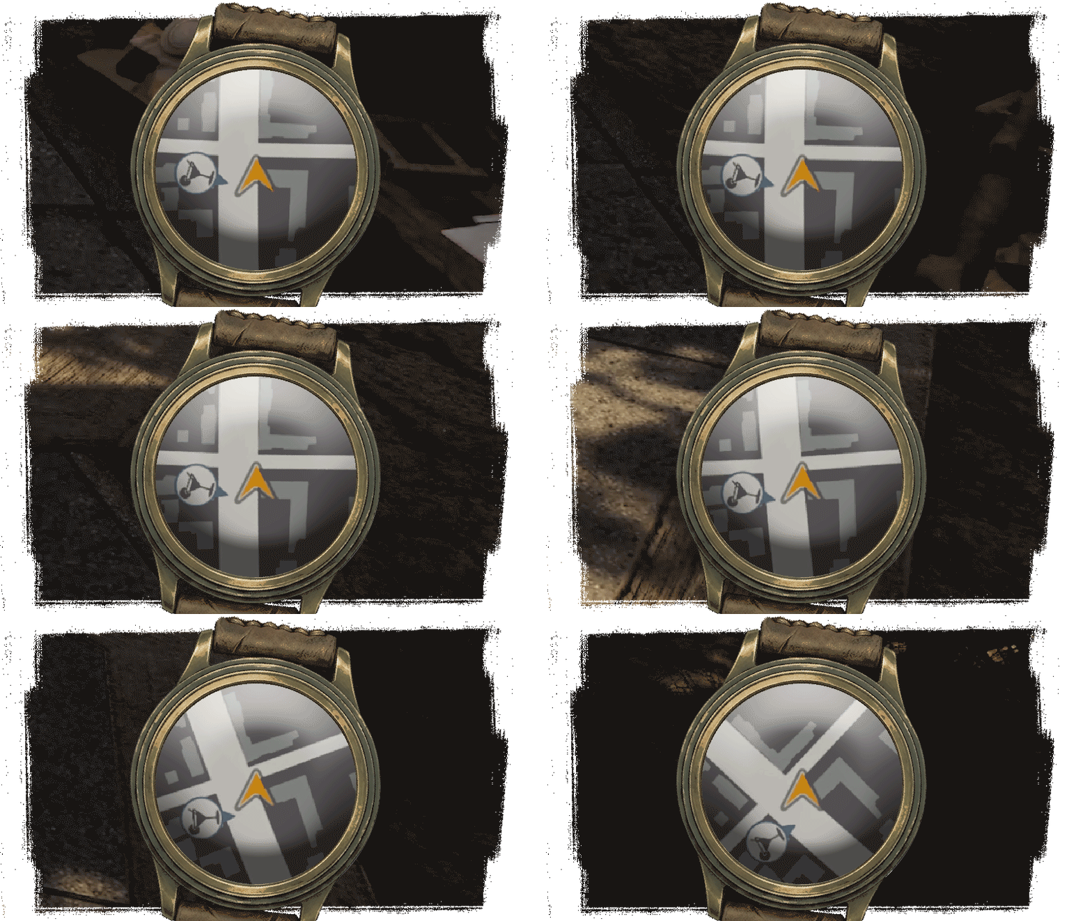
Instead of a standard, generic map frame in the corner of the screen, we decided to give it a unique touch. Our minimap is still conveniently located in the screen's corner, but it's styled to look like a classic wristwatch. It provides all the necessary navigation and keeps things clear, while seamlessly blending with the game's overall aesthetic.
Tablet Inspections
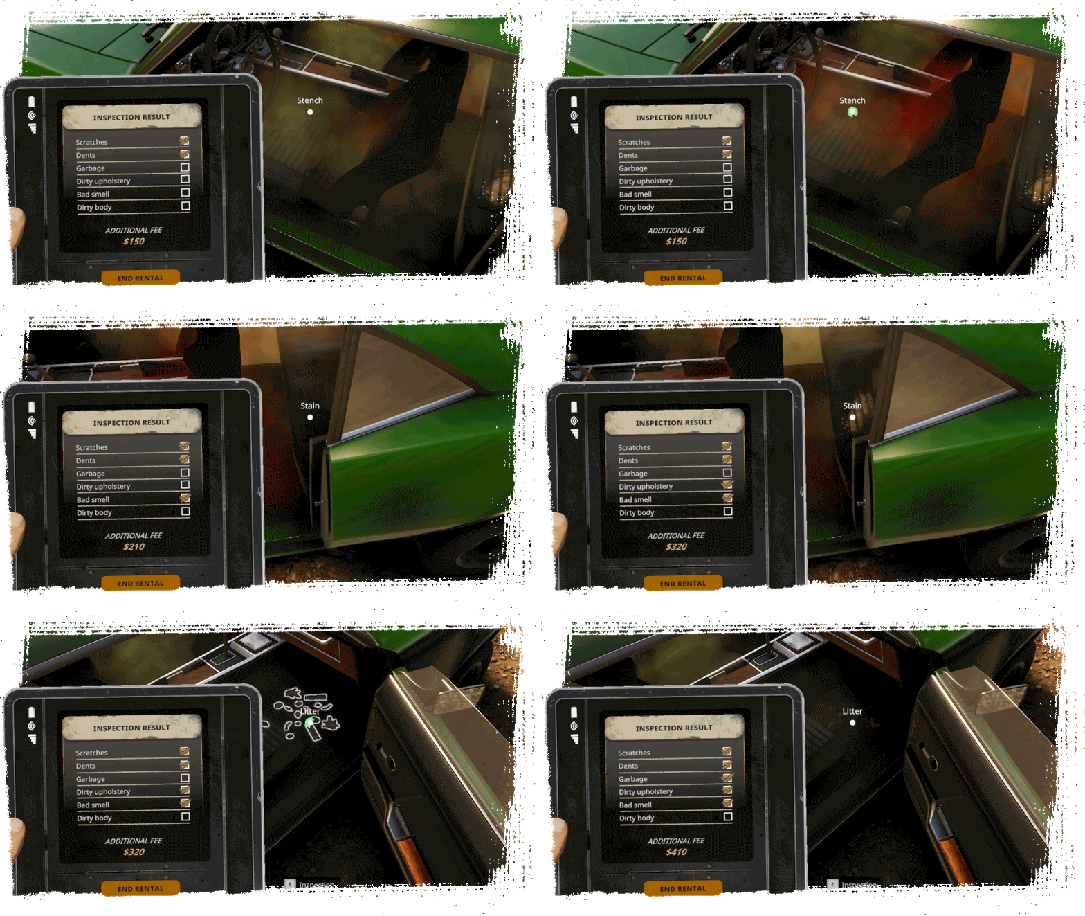
When a car comes back from a client, you need to check its condition. Instead of a standard pop-up screen summarizing the damage, we’ve integrated the inspection process into a handy in-game tablet. You physically walk around the vehicle, spot the issues-like dents, scratches, or even a bad smell inside and check them off your list in real-time to calculate additional fees. It makes the assessment process feel like an actual part of your daily routine rather than just clicking through a spreadsheet.
What's next?
We are constantly looking for the perfect balance - combining usability with aesthetics. We're stepping away from visual chaos in favor of a calm, readable form and a cohesive style. Generic solutions just aren't for us.
We are really curious about your opinion. What do you think about this approach to the UI? Let us know in the comments - we don't like to guess, and your concrete feedback is the best foundation for our further work.
Don’t forget to wishlist Car Rental Simulator, and stay tuned for more updates!

PS. Don't forget to add the free Prologue to your wishlist!
https://store.steampowered.com/app/4014180/Car_Rental_Simulator_Prologue__Early_Days/
We also encourage you to check out the anniversary updates in Car Dealer Simulator
https://store.steampowered.com/app/2404880/Car_Dealer_Simulator/