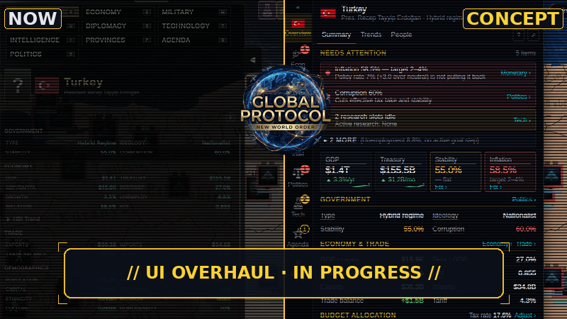
Hello, world leaders!You told us the interface is cluttered and hard to read. We agree, so we are rebuilding it.
How we are doing it
We went through every screen in the game and listed everything it shows
We redesigned the layout from scratch and drew every screen again
The map stays visible: the left side is your country, the right side is whatever you click
Solid panels, bigger text, and colours that mean something: red only when something is wrong
Nothing is removed. Every number you use today stays in the game, even if some move one click deeper
A first look
Some early concepts we are working on. The images above show today's Overview screen next to its concept. Some will change, and some might not make it into the game at all.
Budget: every slider shows what it costs per month, and Apply stays in view.
Recruitment: readable stats, and when you can't recruit, the reason and where to fix it.
Provinces: a side panel instead of a big window, so you can keep clicking around the map.
Diplomacy: relations grouped from friendly to hostile, with the full breakdown on hover.
Tell us what you think
Which screen bothers you most today? Let us know in the comments or on Discord.👉 Join us on Discord!