Demo Update #2: clearer first minutes, better planet markers, and more
Zenith Expanse · published
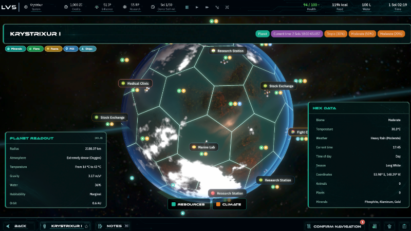
Hey, Explorers! I’ve just pushed another demo update. This one is not a “big new content” patch. It is mostly a “the demo should stop fighting you while you’re trying to learn it” patch. :D After the first release I got a lot of useful feedback about the opening minutes being confusing, especially around scanning, finding resources, landing, understanding what the planet actually contains, and coming back to a save without losing the thread. So this update focuses heavily on that.
What changed
The first steps should be easier to follow now. Early onboarding now does a better job of pointing you toward the actual next target instead of just telling you what to do in text.
Water and fauna objectives now have clearer targeting. The game can now guide you toward specific planet/sub-hex locations for early survival objectives, which should make “find animals” and “secure water” much less vague.
The starter planet is less chaotic. I changed the demo starter planet logic so it should avoid weird starts like ocean-heavy worlds with mostly aquatic life, barren planets, or ecosystems that make the first survival steps unnecessarily awkward.
Planet markers got a big readability pass. Resource, flora, fauna, POI, ship, and settlement markers were redesigned to be more compact and readable. Empty labels should no longer appear just to add noise.
The planet legend is now more useful. Category pills such as Minerals, Flora, Fauna, POI, and Ships can now work more like quick filters, helping you focus on what you’re actually looking for.
Player settlements should stand out better. The player colony marker now gets clearer treatment instead of blending into NPC settlements.
Scanning planets should be easier to understand. Scan progress is more visible, and completed/stale scan orders should be less likely to block a new scan attempt.
Save/load got more hardening. I fixed several cases where loaded saves could restore UI, resources, quest targets, crew state, or order state incorrectly.
Startup and loading should feel less weird. Some of the empty/half-loaded UI states during load were cleaned up, and the game should be better about keeping time/state under control while loading.
Quest pill and tooltip polish continued. The bottom quest pill, rich tooltip, and quest target restoration got more fixes so returning to the game should be less disorienting.
Sub-hex UI got another pass. The detail modal, bottom bar, order buttons, and scaling behavior were adjusted to be clearer and less prone to overlap.
Why this update exists
The short version: the demo has a lot of systems, and the first version expected players to connect too many dots too quickly. That was not great. So this patch is about making the opening less hostile to curiosity. You should still be exploring, making decisions, and figuring things out, but you should not be fighting the UI just to understand where the water is or why a scan is blocked.
A small note about old saves
I did improve save/load behavior, but if you started a save in the very first demo build and something still feels strange, starting a fresh expedition will give you the cleanest version of the updated onboarding flow.
What I need from you
If you try the new version, I’d love to know how the first 20-30 minutes feel now. Especially:
Do you understand what the game wants you to do next?
Are planet markers readable enough?
Can you find water/fauna without feeling lost?
Does performance feel okay on your machine?
Does loading a save behave as expected?
As always, feedback in reviews, Steam Discussions, or Discord helps a lot.
Have fun!
Szymon