Update v1.0.1 - User Interface, Tutorial and Quality of Life
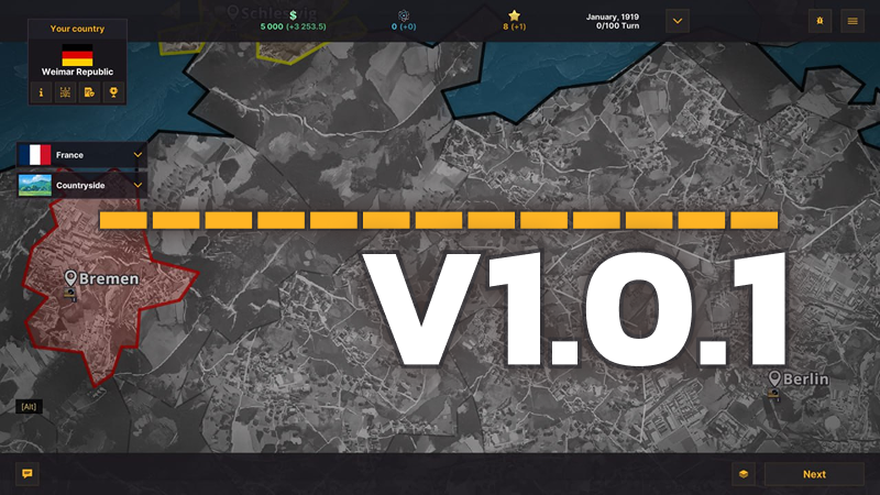
Hello! We’re extremely grateful to everyone who sends us feedback about the game—please keep it coming. We read every review and turn them into tasks in our tracker.
Top Priority – Clarity
Our current top priority is to make the game’s interfaces as clear and user-friendly as possible. After three years of closed beta, we (the developers and veteran players) have grown accustomed to some of the old solutions, which aren’t always obvious to newcomers. That’s definitely on us, so even now, at 2 AM, we’re working on fixes and will keep at it!
Also, starting today, our experienced designer Ivan has joined the team. Early this morning we compiled a list of over 30 tasks—and the first ones are already done. Here’s the new update!
What’s New in This Update?
- Tutorial hints added: the text now contains hyperlinks that, when clicked, instantly show the relevant city or country on the game map.
- Hovering over the “Relations” icon now displays which factors contribute to the final score.
- In the “Lenses” and “Buildings” menus, we’ve added tooltips with all the info you need to decide.
Text Size
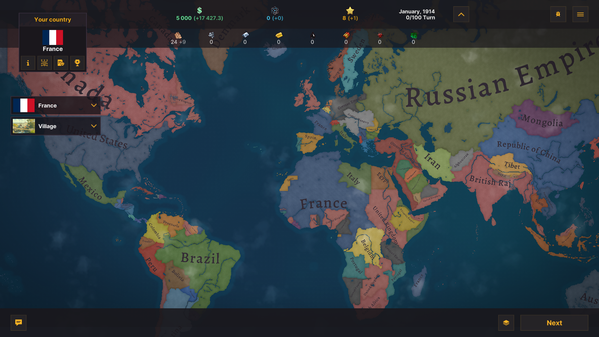
We’ve reduced the size of text and UI elements in various game windows so that large monitors have more free space for the map.
Tech & Policy Trees
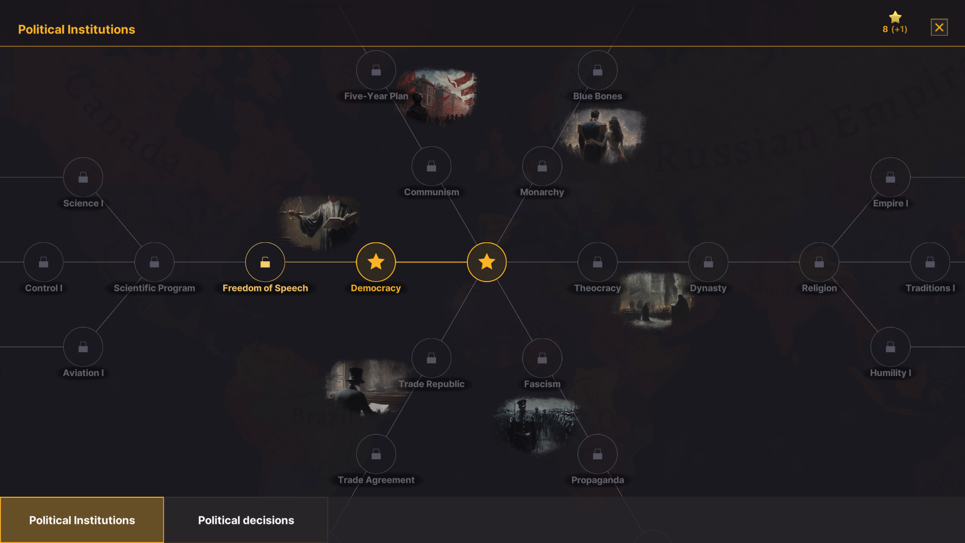
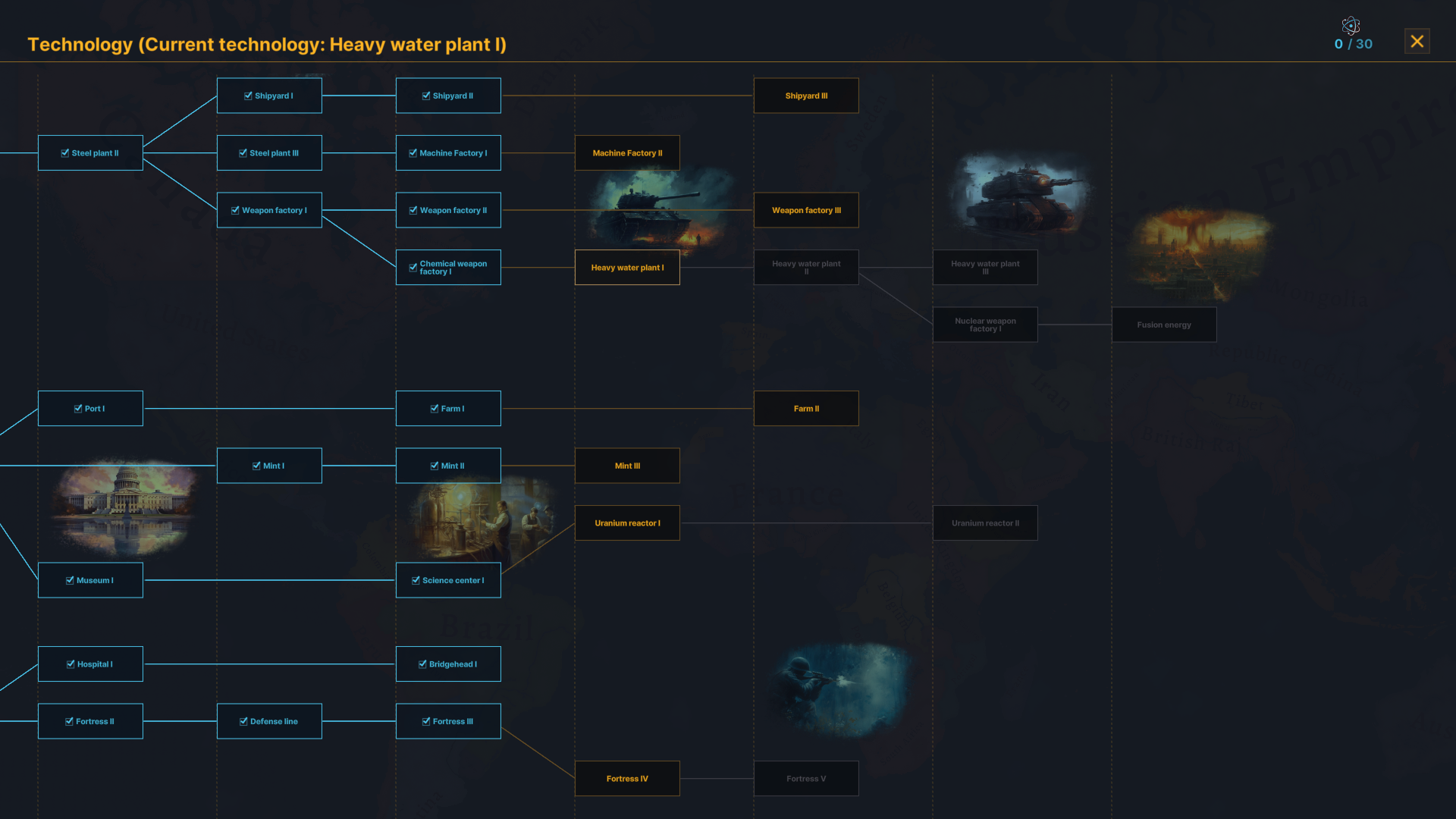
Zooming controls have been added to the technology and policy trees. Now you can zoom in and out on their elements.
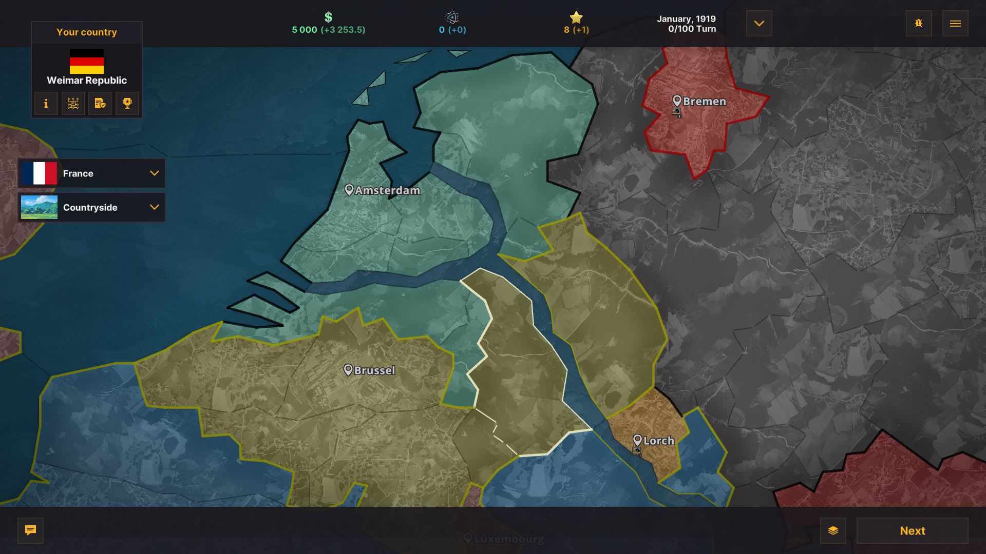
Capitals
We’ve improved the readability of capital names on the map by increasing the font size and making the icons more contrasting.
How to Join the Development?
Want more Warnament? We hear you! Here’s how you can help:
- Suggest ideas on our Discord: https://discord.gg/WwfsH8mnuz
- Create maps in the free editor: https://discord.gg/ZwqFJa7Vc
- Host your own multiplayer server: https://discord.gg/sdfKwEhzY9
- Write a game guide: https://discord.gg/nVCePtrh8G
- Help translate into your language: https://docs.google.com/spreadsheets/d/1KC2lUhAkhjjRdgyJfvnGM4j0iASJu_SGtlgll9rCS5s/edit#gid=647009194
- Play the free Android beta: https://play.google.com/store/apps/details?id=com.ludenio.a7&hl=en
- Subscribe to our YouTube channel: https://www.youtube.com/@warnament
- Follow us on Twitter: https://x.com/WarnamentGame
- Leave a comment under your favorite content creator’s video to tell them about the game