Hello, sinners! I'm Mike Bernat from Shockwork Games and I'm here to talk to you about how the art style of Nadir came to be.
From the very beginning, we wanted an art style that would stand out from the crowd. There are not that many black and white games on the market, and both Alex and I are Masters of Arts, so we wanted to use our skills a bit more.
I like to have even a single image when I’m creating a Game Design Document, so I created something like that:
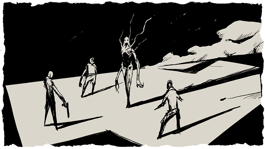
It’s way easier to design mechanics and UI when I actually see the mockup of the game screen. Our brains are very good at warping reality, and something that you think will look and work well can quickly fall flat when you actually try it out. That’s why prototyping is so important.
Ok, but let’s go back to the art, shall we? So from the very beginning, I wanted 1 thing:
very strong contrasts of white and black. At this stage, that was all, just a game with cool-looking monsters and characters... in 3D. You read that right, the original plan was to make a modular system to create monsters from parts that were...yeah, “ambitious” to say the least.
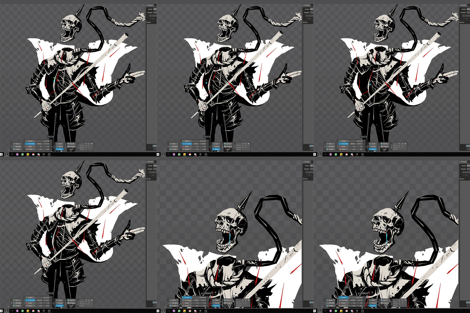
Then I started to use Spine for my commission work. What is Spine you ask? It’s software for skeletal animation, which sounds very nerdy, but it’s something really cool. Basically, it’s an industry standard for making high-quality animations, that can work in 60fps. But what was more important to me was that it limited the number of assets we had to make. And we wanted to make lots of these monsters and characters, so we needed this simple, yet effective way of creating content.
Spine turned out to be the perfect tool for us. Since Nadir has this jRPG DNA, we could focus on high-quality art, and put some life into it using Spine. The first tests were really promising, so we didn’t hesitate and simply went all in with the idea.
At that point, Nadir was supposed to be this strange mix of Cyberpunk and post-apo, heavily inspired by Blame! manga. We even tried to acquire the license for Blame!, but it didn’t work out. Even at that time, the game was looking pretty solid but we felt that we needed this final “thingy”, this little something that would make the game shine. Like hell.
So bam, we literally turned things upside down, we were not escaping from the city to the surface anymore, no. Now we were traversing down the Circles of hell, to the heart of Darkness. We took Divine Comedy as a base for the themes in the game, and it went from there to what you can see right now. Alex polished up the character designs using her very unique style, and I tried to follow suit. New UI from our UX/UI artist, Emrah Ozbay got a nice, daemonic look, and we are now adding even more hellish, or at least creepy additions that would fit the game in its new state. We are really happy with how it looks, and we sure hope you will like it as well!
That's it for this devlog. If you liked this look into Nadir's creation process, stick around, and keep on the lookout because there's more where that came from. If you have any questions, feedback, or nice words for the dev team, please leave a comment! We truly appreciate hearing from our fans!
You can join the Shockwork Community Discord HERE if you'd like to talk to like-minded people, and you can follow Nadir on Twitter HERE, to never miss an update or, if that's not your style, like our Facebook Page instead.
Till next time, sinners.