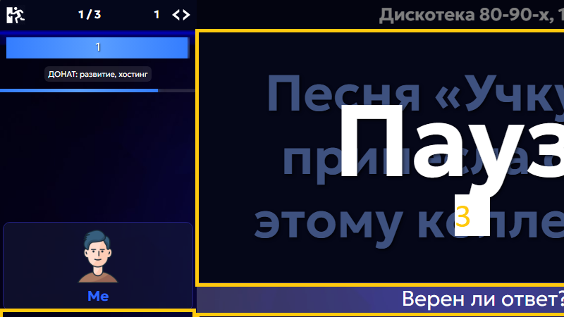
A question about placing the dialog for the host to review answers. There are 4 possible options (they are shown as areas 1, 2, 3, and 4 on the screen). Currently, area #1 is used (on phones the information is always displayed in the center, but there are no other options there anyway — that’s not what this is about).
We’d like to discuss other placement options and hear your opinion.
1: The familiar option. But: you have to shift your gaze, it’s small, and it takes up space from the chat and other areas.
2: More logical (the information for the host is located under the host). It doesn’t interfere with other areas. But: you still have to shift your gaze, and there’s even less available space.
3: Very large and very noticeable for the host. But: it covers the question itself.
4: Also noticeable for the host and doesn’t cover the question. It most closely resembles the window from version 7 of the game. But: it covers the players.
Options 3 and 4 are not suitable for streamers, since they need to hide the answers on screen. However, only about 1% of all games are streamed, so a separate mode can simply be provided for them. What we care about is convenience for the majority of hosts.
We’d like to hear your thoughts.