in order to receive this update, you have to use the experimental build of the app!
NOTE: Most of this update is design-related
Changes
Let's all welcome a new design language: StudioUI 2!
Why the redesign?
- The app provided a very poor experience for low-contrast monitors / colorblind users.
- The old design language didn't provide a proper reaction to interaction.
- The old design was generally inconsistent.
Let's see what's new:
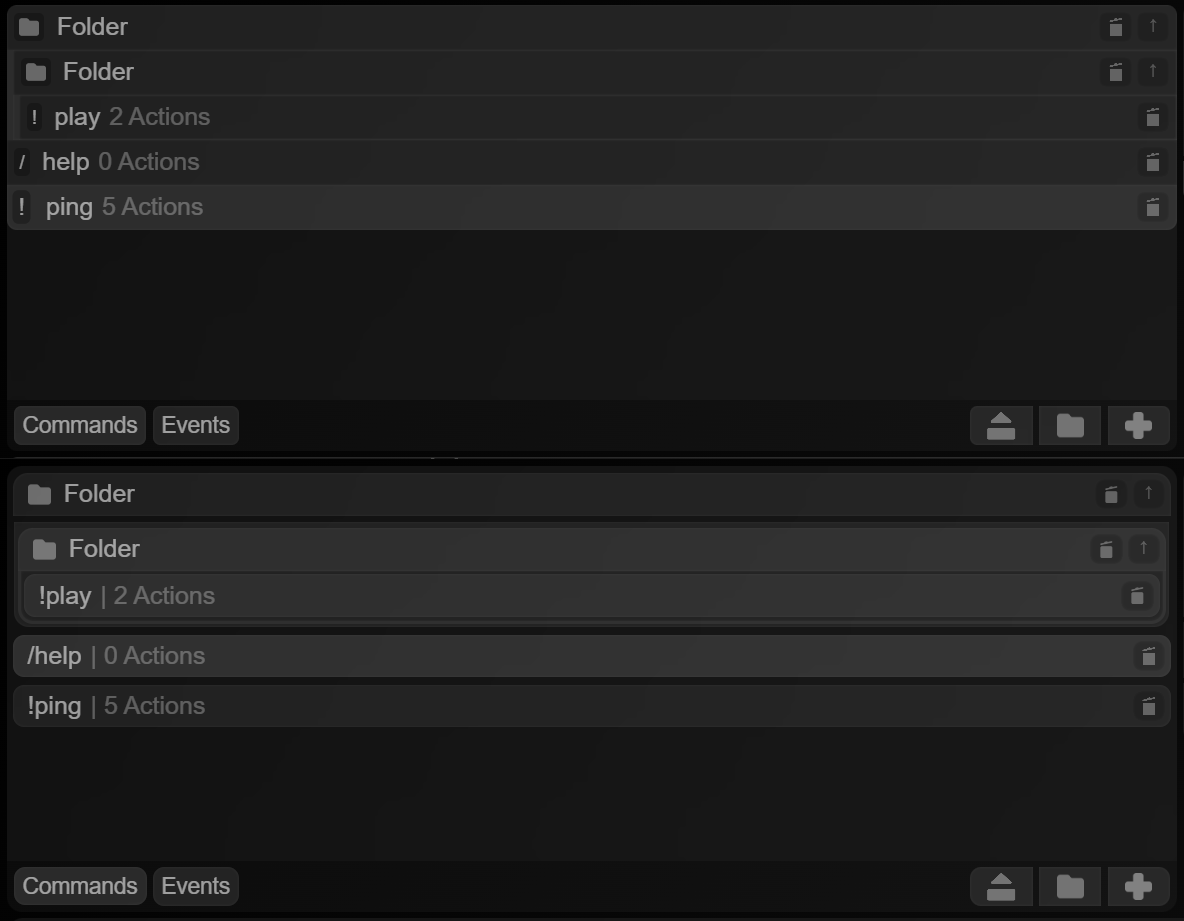
(top image: new, bottom image: old)
- Commands within folders are now marked with a simple bar at the left - easily allowing for multiple commands inside one singular folder!
- Elements occupy all the space of the container
- Command symbols are contained in an indicator box (you're going to see a trend)
The same design language applies to actions too, but the changes aren't as noticeable:
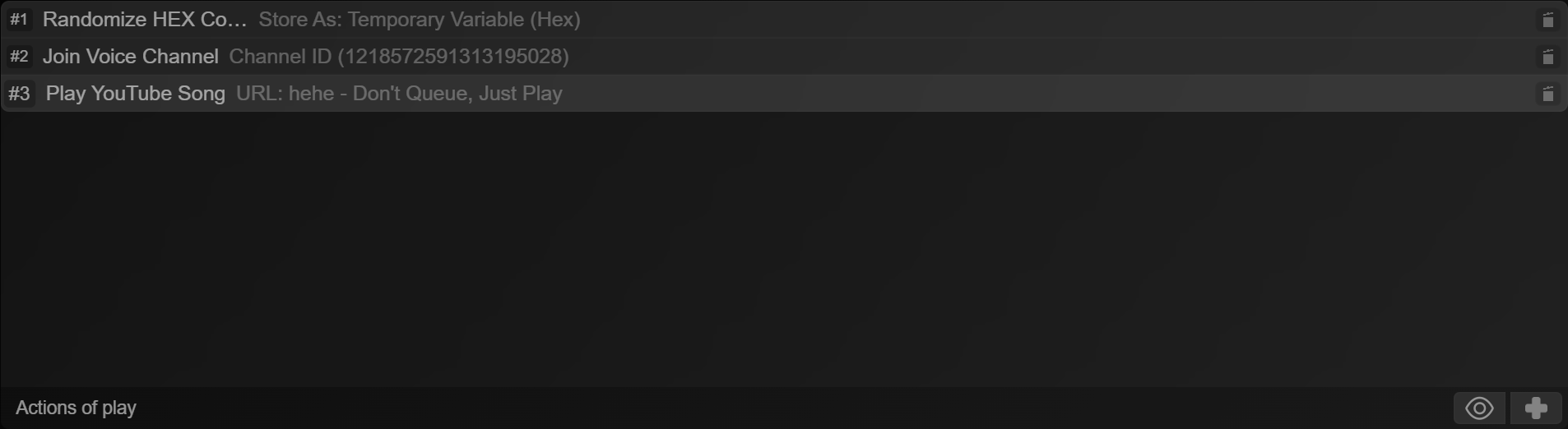
Now, let's move on to interaction reactions a bit - this was seriously changed.
STATE:Normal

STATE:Hover

Element grows a border inside of itself, element text moves to the right.
STATE:Active

Element maintains border, but uses accent color. This is not seeable in the provided example, but the accent color can be a different color other than white. Currently, the accent is not settable from within the app, but that's a planned feature.
STATE:Selected

Element indicator receives scale-up, whilst element itself slightly glows, element text slightly moves to the right.
Let's take a look at the command info pane. Notice what's changed?
Current
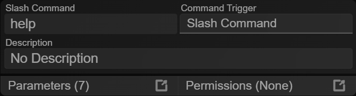
Old
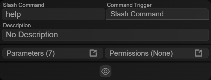
It's become less bulky! It also adapted parts of the new design language (where it could).
Moving on to parameters, they were also redesigned (& new functionality was added too!)
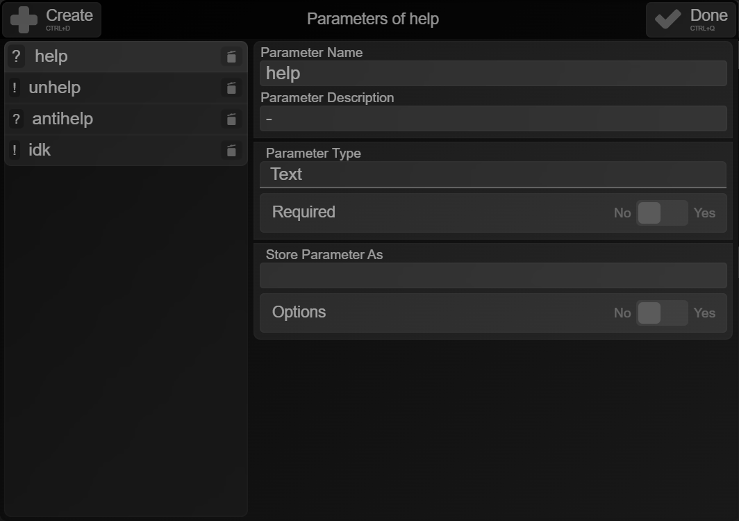
Parameters adapted the current design language. Not only, but now they have either a "?" or a "!" inside the indicator box to show if they're required or optional!
Also, you can also use the up/down arrow keys to browse parameters & del to delete one.
I also updated right-click menu animations to further feel more consistent with the rest of the app
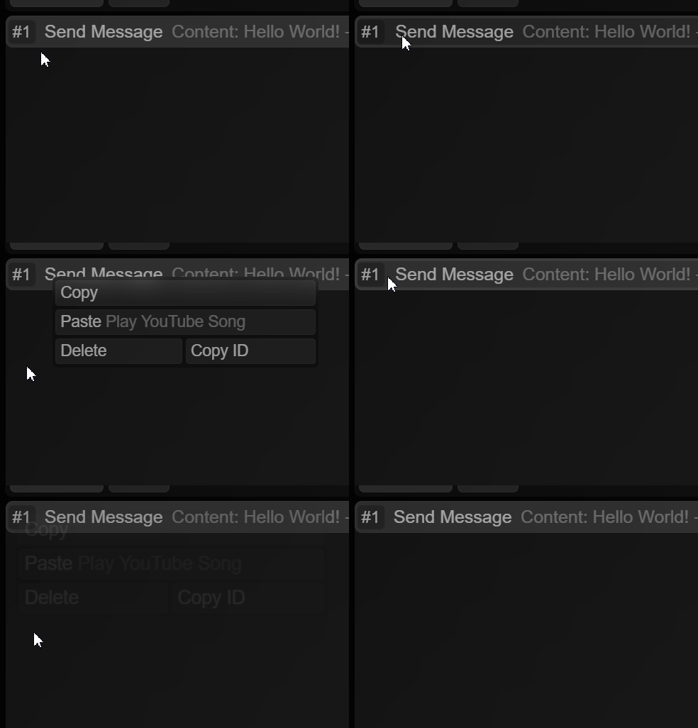
Variable insertion was also updated - but not just visually
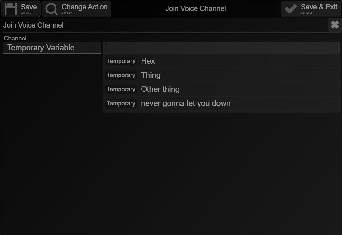
It also has a better, non case-sensitive, whitespace-ignorant search algorithm.
Updated action search - with the one crucial feature I didn't add.
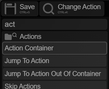
You can now use the up/down arrow keys and enter to select an action you searched for! An outline will be placed around the action you searched.
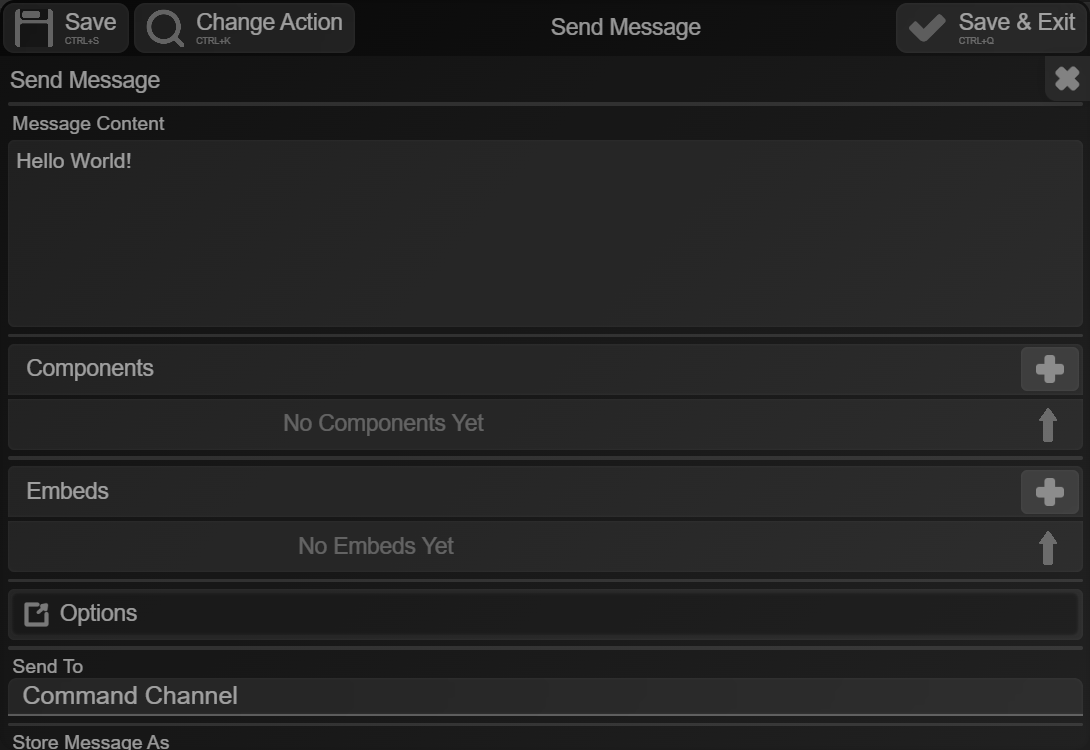
The action window was also darkened
Current
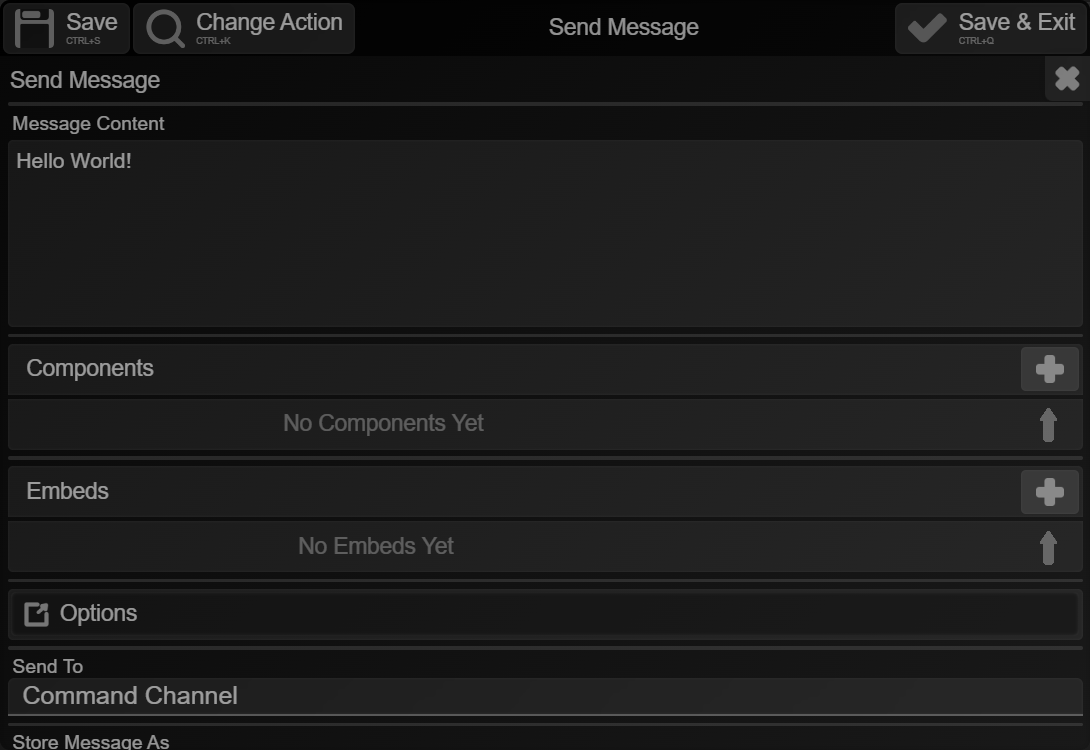
Old
Toggles were also updated (again)
Current

Old

Not only has their animation changed, they got smaller (therefore allowing for more content)
Say hello to search! (again)
Search was first introduced back in October - just a while after the app launched. Search was very basic, though! Now, search can run automations (more about these later) & look for commands/events and actions.
Not to add, search was also redesigned to further match the design language of this app
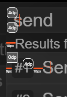
The animations were also updated:
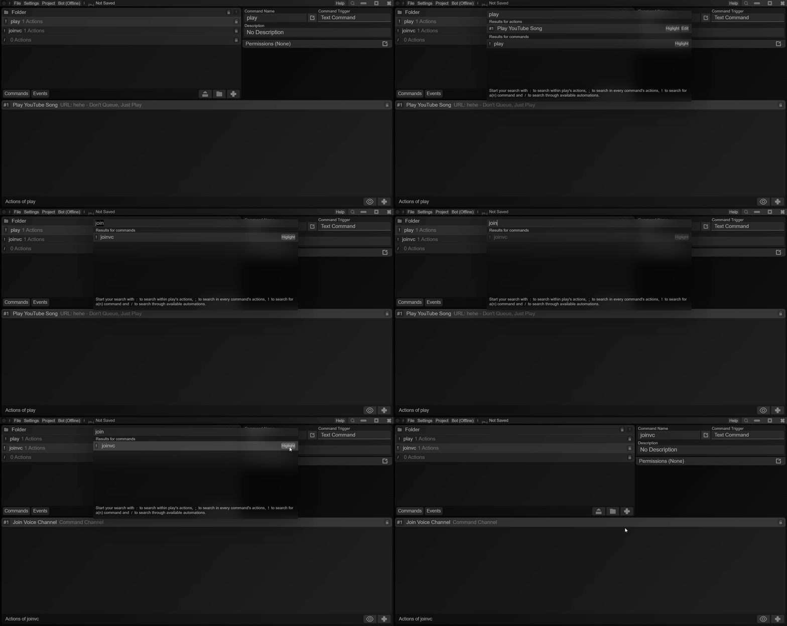
Send Message update options
Remember when edit message was a separate action? When it was merged into send message, the "Don't Edit" feature was taken away - but it's made a comeback!

Other Changes
- Set Bot Activity received a "Streaming" option
- Added a boost event
- Fixed lag in permissions editor
- Get Message Info > Content on message commands returning undefined has been fixed
The redesigns don't stop here - but I'm just waiting for user feedback.