Status
SteamPeaks
ChartsSalesUpcomingPatchesNewsCalculator
New on SteamEvery app, DLC and depot the minute Steam creates itAppsEvery app on Steam, newest change firstPackagesSubs and bundles, and what each containsDepotsDepots, manifests and install sizesTagsSteam's user tags and the games under themDevelopers & publishersCompanies and their cataloguesTechnologiesEngines, SDKs and anti-cheat found in the filesChange historyEvery PICS changelist as it lands
SignalsNineteen readings of the whole catalogueCompareAny games side by sideRecordsAll-time peaks and the days they were setReportsWeekly and monthly write-upsAlerts & newsroomWatch a game, get told when it movesSteam statusIs Steam up, right nowWeb API explorerTry the endpoints in the browser
NewsSteam's own announcements and the sales calendarCalculatorWhat a Steam account is worth, and its pile of shame
/
Sign in
/
SteamPeaks
The ultimate resource for Steam data.
ExploreChartsSalesSales and festsUpcomingPatchesNewsRecordsTrendingSignals
DatabaseAppsPackagesDepotsTagsDevelopersTechnologiesChange history
ToolsCalculatorCompareSearchAlertsSteam statusAPI
SiteMethodologyFAQDiscordSupportSign in via Steam
Not affiliated with Valve or Steam. Game names and artwork belong to their owners. All times UTC.
PrivacyCookiesFair useStatus
SIGameNewsQuestion about showman panel
Community

Question about showman panel

SIGame · published 23 Dec 2025, 10:55 UTC

All newsPlayers around this dateRead on Steam

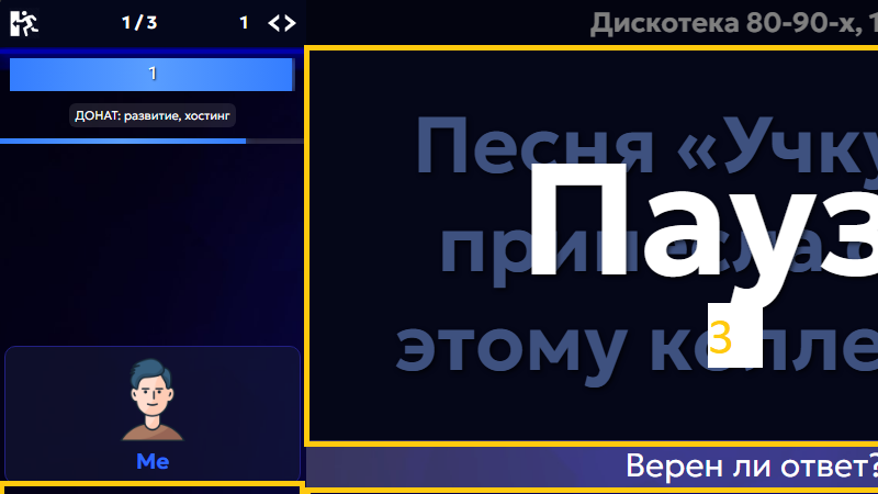
A question about placing the dialog for the host to review answers. There are 4 possible options (they are shown as areas 1, 2, 3, and 4 on the screen). Currently, area #1 is used (on phones the information is always displayed in the center, but there are no other options there anyway — that’s not what this is about).

We’d like to discuss other placement options and hear your opinion.

1: The familiar option. But: you have to shift your gaze, it’s small, and it takes up space from the chat and other areas.

2: More logical (the information for the host is located under the host). It doesn’t interfere with other areas. But: you still have to shift your gaze, and there’s even less available space.

3: Very large and very noticeable for the host. But: it covers the question itself.

4: Also noticeable for the host and doesn’t cover the question. It most closely resembles the window from version 7 of the game. But: it covers the players.

Options 3 and 4 are not suitable for streamers, since they need to hide the answers on screen. However, only about 1% of all games are streamed, so a separate mode can simply be provided for them. What we care about is convenience for the majority of hosts.

We’d like to hear your thoughts.

More from SIGame

Other announcements

All news
Major update9 Aug 2026SIGame 8.13.2Thanks to user GoldensFire for help with this release! · Ability to start a game using a Steam account (previously, it was only possible to join a game using one). · Duplicate the package comment in the chat. · Separate fullscreen button. · Preserve the voice chat link after restarting the tab. · Link to the official Discord channel in the main menu. · Improved content preloading interface. · C…In-game event25 Jun 2026SIGame 8.12Ability to log into the game using your Steam account. · Personal statistics for games played. You can see which question packs you have played, who you played with, and how many points you earned. Statistics are stored on your device and are deleted when browser data is cleared. Once accounts are introduced, it will be possible to store statistics on the server. · "Undo" and "Redo" buttons in…Game update7 Jun 2026SIGame 8.11.5Service pack update for SIGame 8.11 containing several bugfixes and performance improvements. Feel free to provide feedback!